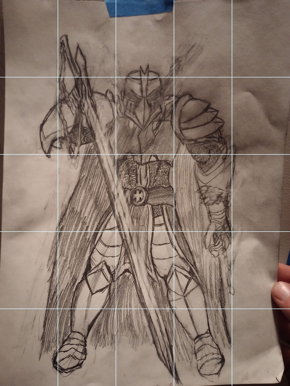
Cavalier Gilded
Acrylic, Gouache
22 x 30 inches


~2.jpg)


Process
This turned out to be more difficult than I thought it would be. I wanted it to feel like a gilded portrait of a medieval knight. Similar to how saints are depicted with gilded gold. In practice, I completely failed at doing this. Initially, I just outlined him. This felt off. I wanted it to feel like a comic book at first, like a gilded cover. It was deeply embarrassing to show this and the original Perfect Illusion at the Midterm critique as I hated both of them. I think the background I made in the final piece is better, I tried to render out the gold with the gilding but should've just stuck to not using gilding at all I think. I don't hate the final piece that much, it is the same level as Perfect Illusion. It hurt me a lot at the time as I couldn't render out my favorite characters. Recently, I feel I have a better handle on this but at the time I felt defeated in every single aspect. That was until I made Hopeless Romance. I felt a lot better after that. I still don't want to paint because of it. I spent so long reworking it. Other people said it was okay, but it wasn't to me.